|
This week's painting combines many new tricks learned from recently discovered art videos, mixed with some of my favorite, personal artistic techniques acquired over the years. I started with a gel-brushed canvas for texture. I used one of my favorite, old color palettes: Burnt Umber, Burnt Sienna and Titanium White. I applied my favorite canvas priming technique with the end goal of suggesting a highly atmospheric, stormcloud effect for the sky, rather than my usual marblish-looking undercoat. Then I palette-knifed in the mountains, tree trunk and branches, using a brush to help me shape the tinier branches. Highlights were kept minimal throughout; in an attempt to create a low-light, low contrast atmosphere. And ultimately I ended up with a very apocalyptic landscape to which Cheer commented "Where's the Floating Skull?"... thus the title. :D It's interesting to note that while my still-life paintings are perhaps a better representation of my artistic skills, I'm actually having more fun and am left with a greater desire to paint again soon, following these little atmospheric, landscapy experiments. Funny thing is, I just finished watching a very timely video by another YouTube artist I like, Ryan O'Rourke, with the basic message that you have to paint what you love, not what other people tell you is art. It presents a challenge for someone who wants to be taken seriously, but genuinely loves playing with the medium. And frankly, I'd rather be excited about painting every day, than worried I might mess up some complex composition I've designed because I fear I lack the skills to pull off. In summary, creating has become so much more than simply showing off what I've learned. Instead, it's become a way to reach that special space where the noise of the world quiets down... if only for a brief while. After years of honing my skills, I'm ultimately drawn to the most important one; the one that reminds me I can do no wrong when I'm in a place of creating. I can now turn a blank canvas and an odd assortment of tools and tubes of color into a magical experience that leaves me smiling every time. Maybe artistic mastery, fame and fortune don't matter as much as my ego would like me to believe. I say it's more important that I've discovered 'Justin's Own' brand of reaching inner peace. I hope you enjoyed this week's painting and blog entry. I also hope each of you is ravenously pursuing your own bliss, despite what the world might think of your path. Your life will be a masterpiece, regardless of what you decide to do with it. I'm simply suggesting you chose to make it a Rembrandt rather than a Paint-by-Numbers. Warmest Regards, Justin 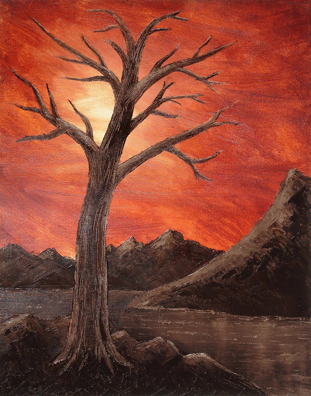
0 Comments
Hello everyone, and welcome back to my blog. You may have noticed an increase in the frequency of my posts lately. I've been on a creative sprint these past few weeks, getting inspired by recently discovered online painting tutorials... and having a ton of fun along the way. I thought I'd take a moment to explain why I've decided to go with this more playful, more graphical direction for a while by giving you a little background on this week's piece. I'm a firm believer in giving credit where credit's due. And now that I've been asked to take over some of the younger art classes at the Joy Foundation, I'm going to need all the help I can get. This week's painting idea comes directly from Cinnamon Cooney's painting tutorials on YouTube. Lovingly known in the community as The Art Sherpa, Cinnamon's approach and attitude are altogether positive, playful and inspirational to the newer, and especially younger aspiring artists out there. Her original piece is entitled 'Beachcombing'; a part of her 2015 #lovesummerart collaboration with a gaggle of other charming YouTube artists I'm just now exploring. If you love painting, and are on the lookout for new ideas, I whole-heartedly suggest you take a look at her huge series of painting tutorials. And I'll definitely include the names of the other channels as I explore and incorporate their ideas into future paintings, and possible class projects. To give you an idea how simple this piece is, her acrylic color palette is Cadmium Yellow, Yellow Ochre, Burnt Sienna, Thalo Blue, Mars Black and Titanium White (I just now realized I didn't even use Burnt Sienna in my oils palette). And other than a nice variety of typical brushes, her secret tool for this piece is a sponge; the more pourous the better. Compositionally, it's even easier. You draw a semi-squiggly line from the upper right to bottom left corner, making sure you start down about an inch from the top corner, and end about an inch up from the bottom corner. Then you proceed to fill the ocean side with deep blue green in the upper left corner blending into a pale white-green as it nears the beach. The beach side starts with darker browns in the lower right corner, blending into a lighter 'sandy' tan color as it nears the water's edge (note that it is not as contrasty as the water side was). Once the colors meet in the middle, you create foam on the water and texture on the sand by gently dabbing white with a sponge (be careful not to work both sides at the same time, in case the paint's still wet). Then you add waves to the ocean side with thick, white paint strokes, and add cast shadows on the beach side, right against the water’s edge with dark brown or green… and you're pretty much done (I stopped there for my practice, but Cinnamon added shells and starfish to the beach for her finishing touch.). Again, it’s a wonderfully easy piece, from an altogether adorable YouTube instructor. I highly recommend you check her videos out. And if you have about an hour to play around, give this painting a shot. You'll be very pleased with how easy it is to get great results on this one. Until next time, Justin 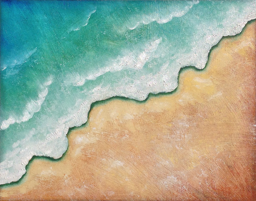 Today's painting and subsequent blog post is more about salvage than success. I'll be the first to admit... painting landscapes intimidates me. It probably has something to do with my propensity for painting in extreme detail, and how landscapes seem to follow the opposite rule... where less is always more. I'm quite confident in my ability to paint the human form and most still life subjects, but man do I struggle with painting nature in a way that looks.... natural?! So, like the Old Masters of art, I YouTubed my way through several hours of instructional video, trying to grasp the basics. I started were any respectable artist would, of course; I Bob Ross'd it for a few episodes and now grasp the concept of what makes a 'happy tree', and the importance of giving that little shrub 'a friend'. I delved into Bill Alexander, and discovered he invented wet-on-wet (don't tell Monet, Van Gogh, and the others), and that I need to find my own 'waie', whatever that may be. I even picked up a few key concepts from contemporary painter, John Magne Lisondra; an incredible landscape painter (who may also be an android).* I gathered many wonderfully simple concepts from these combined lessons... Unsurprisingly, I had multiple confirmations that depth is best suggested with base fill colors that are darkest in the nearest objects, growing paler as the objects become more distant (see my experimental painting on Jan 26th to see what I mean). It was also repeatedly verified that you start foliage with the darkest shadow regions first, adding midtones, then highlights, to turn the form. Watery reflections are best represented first with soft downward strokes using a soft brush to pull the colors uniformly, then gentle back and forth strokes to suggest the effect of subtle wave-like motion. And I noted that each of them finalized most of the details of background objects first before placing focal objects in front of them, rather than painting all the mountains at the same time, then all the ground cover at the same time, then all the tree trunks at the same time, then all the leaves at the same time, etc. (And if I'm understanding correctly, based on Bill and Bob's setup, I need to have about $300 worth of oils on my palette before I begin.) ;) So what did I learn specifically from painting this piece? I learned I'm probably better off working from real life (or at least real life images as reference and inspiration) and that my imagined landscapes are not very... imaginative. I learned that sometimes you have to throw in the towel on one slowly failing concept to open yourself up to playing with other variables. And I learned I will probably be much more satisfied with my landscapes if I use un-textured, un-primed canvas for those pieces, saving the pre-textured canvases for things like... oh say, Carmen Miranda sporting her best Sunday hat. All in all, I'm considering this a highly successful salvage of a piece that wouldn't have otherwise stood up to any of the best rules of interesting composition, or nature behaving naturally. And incidentally, I've stumbled upon a rather interesting design technique which I definitely wouldn't mind playing with in other graphical contexts. As always, I had a great time giving it my best effort, which marks a success in my book. I hope you enjoy my newest painting, "Storybook Mountains". It's definitely a departure from my usual creations. Best wishes to all of you, Justin * (Please note: I have the deepest respect for all the instructors I researched, and anyone else brave enough to share their skills on the internet for the benefit of others. I'm just enjoying a little light-hearted ribbing in this post. I loved watching every last one of these videos, and learned tons.) 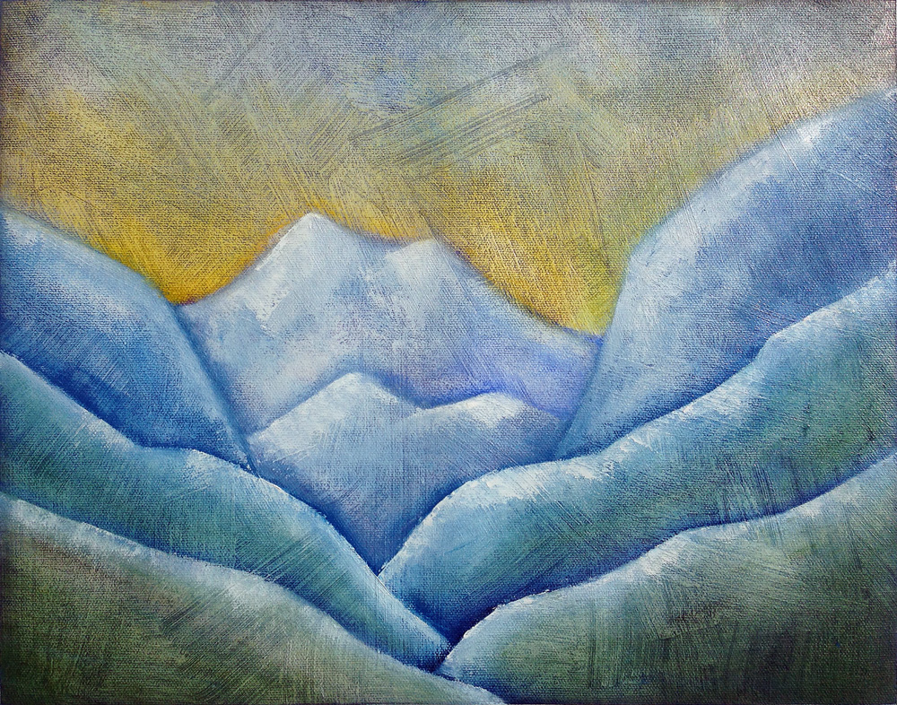 I allowed myself every excuse for not feeling motivated to create last week's painting. None of them stand up to the simple fact that I love painting... once I get started. I just have to get that first stroke on the canvas and I'm good. The irony about last week's painting was, I had so much fun trying a new texture technique, I enthusiastically jumped right into the next one. This time I also challenged myself to finally paint a rather complex piece of pottery I purchased from a local potter a few years ago. (I'm sure you'll understand my hesitation. That's a seriously complex pattern on the front.) This one took me three sittings. And it was worth every brush stroke. I'm thrilled how well the details translated. I also tried the same texturing effect as last week and really enjoy how atmospheric it is. That said, I'm not sure how I feel about splitting the horizon through the middle of the canvas, or of having painted it at such a definitive angle. It made sense from a compositional standpoint, leaving no odd tangents through my objects... but it doesn't feel quite right for some reason. I'll need to leave it unviewed for a few days... come back with fresh eyes; see if it's just a temporary misfire of the neurons, or if my instincts are legit. :) For now, I need only remind myself that it is the journey, not the destination, that makes our lives meaningful. I learned tons. I had a blast while painting it. And I'm very excited to start another piece already. That makes it a wonderful success. I hope you enjoy it. Warmest regards, Justin 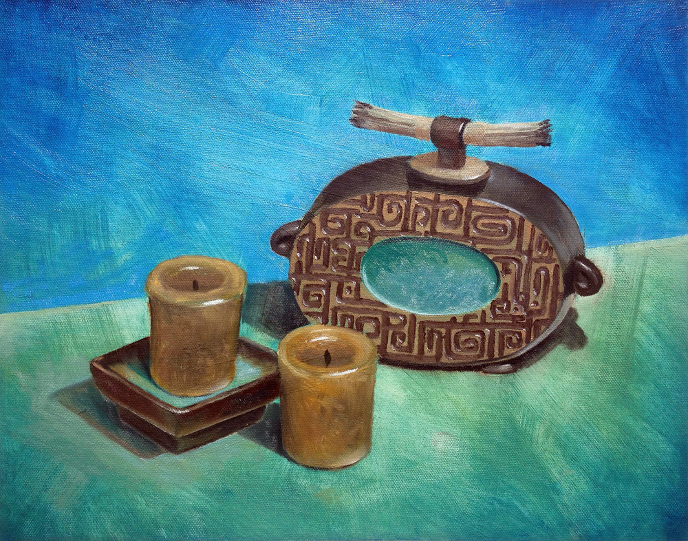 |
AuthorHello everyone. I'm Justin Mackay. I'm a creative soul, an explorer of life's mysteries, and a big fan of all the beauty in the world. If you're just here for the paintings, then head on over to my Art tab. If you wish to delve deeper into the odd thoughts of a pondering mind, then this is the place for you. Archives
February 2018
Categories |
 RSS Feed
